top of page

A summer campaign and rebrand for Kopparberg that celebrates what the brand truly is.
We all know that Kopparberg is a sweet, fruity, light cider and isn’t bought by traditional cider enthusiasts. By owning the fact that this isn’t a ‘proper’ cider, we have crafted a more honest brand with its audience and truly owns its fun, sweet and tasty gap in the market.

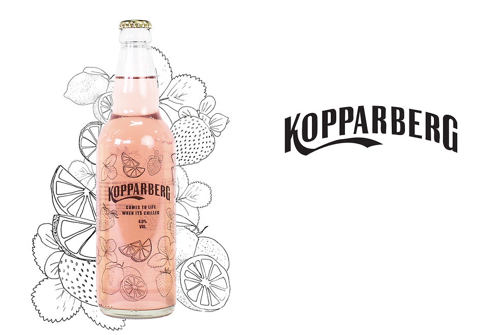
The new logo has dropped its serifs, reflecting the nature of Kopparbergs drinks more effectively.
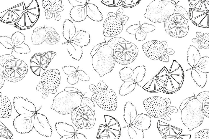
The light colour scheme showcases the drinks fruity flavours, and clear bottles allow the brightly coloured cider to make a statement. The hand-drawn illustrations showcase the flavours used to craft the new flavours.

bottom of page